In this activity I will be finding inspiration for and creating three new logos. These will be my own personal logos for my portfolio and website. I will be looking on Pinterest for inspiration and good examples of well designed logos. I will also use Facebook to ask people what they think of when they hear my name so that I will find out more about myself. All of these tools will help brand myself. I will then be sketching 30 logos to choose from. I will get feedback and using Adobe Illustrator, create three new logos to choose from for my portfolio and website. These are the basics of this project and here is the timeline:
Identity Timeline
4/22 Wed: Social Media experiment /Pinterest assignment.
4/23 Thurs: More brainstorming and looking for inspiration.
4/24 Fri: Start sketches.
4/25 Sat: Continue sketches.
4/27 Mon: Get feedback and pick three.
4/28 Tues: Choose color scheme and fonts.
4/29 Wed: Start logo one.
5/1 Friday: Logo one/ Get feedback.
5/2 Sat: Start logo two.
5/4 Mon: Logo two/ Get feedback.
5/5 Tues: Start logo three.
5/6 Wed: Logo three/ Get feedback.
5/7 Thurs: Get lots of feedback and refine
5/8 Fri: Project due by 5:00pm/ last minute touches.
Facebook Post:
The social media activity worked very well. Here is what I asked on my Facebook post: “Okay friends I need your help. This is for a class. Here we go! When you think of Hilary Hendricks what words come to mind? So in other words, what do you think defines me as a person? I need at least ten responses. Thank you for your help! Ready go!”
The response was overwhelming and I got a total of 35 responses. Here are just a few:
Witty, smart, and completely adorable!
You are one of the most genuinely kind people I’ve ever met! And I admire how strong your faith is in what you believe!
Happy, Fashionista, Korean, Bread.
Considerate, kind, hard working.
Sweet, caring, confident, family oriented.
Compassionate. Independent. Inspiring. Funny. Intelligent.
Happy. Positive. Always with a big smile.
Beautiful!!! Big hearted, always smiling!
Athletic and full of spirit!
I would say Funny, Dependable. Motivated.
Beautiful, tenacious, smart, spiritual, kind, thoughtful, hard working, honest.
Honest, Faithful, Athletic, Vibrant.
There were many more kind things said, but those seem to be the most varied. There were some that also repeated the same word or quality. If I learned one thing it is that people notice.I didn’t realize people thought I was a hard worker, fun or funny, or dependable. I have a lot to offer people and I am proud of the way I have conducted myself so far in my young life. I want to create a logo that shows hard work and effort.
Audience:
I am still trying to figure out who will be looking at my website. Friends and family will of course be glancing at it. However, I do think that I will be posting a lot of photography and design activities. If I could reach out to future employers then that would be wonderful. As of right now, I would brand myself as an aspiring photographer who dabbles in web design.
Pinterest:
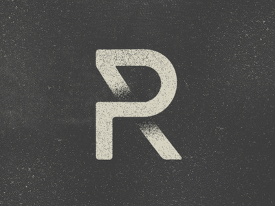
PR by Jacob Nielsen
This was one of my favorite logos that I found. The colors are subtle and have a nice texture( which I don’t see often). I love how it is all connected. It has a feeling of completeness or gestalt. And the best part is the back of the “R” where it fades. I like looking at it. Simplicity is bliss. Here is a link to the website I found it on: http://www.fromupnorth.com/archive/logotypes/35276/
There rest of the images I pinned had similarities to those described above. They had subtle colors and were very connected. The designs were simple, but unique. The letters were beautiful and fun to look at. I hope to obtain a similar look. A clean and simple logo, but not boring. Here is my identity board in Pinterest: https://www.pinterest.com/hilsyeah/identity/


